Typography in design
Typography is the art and technique of arranging type, type meaning letters and characters.
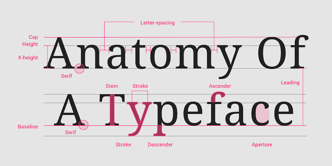
A typeface is a collection of letters. While each letter is unique, certain shapes are shared across letters. A typeface represents shared patterns across a collection of letters.
Typefaces that are selected for their style, legibility, and readability are most effective when following the fundamental principles of typographic design.
Why Is Typography Important?
Typography is absolutely everywhere. Just look at your phone, a billboard, your coffee cup, or even the different styles used in this blog post. Every font, letter, and character arrangement plays a part in determining how a message is conveyed.
Serif verus Sans-Serif
"Sans" means without, so Sans-Serif means without Serif.
Type Classifications
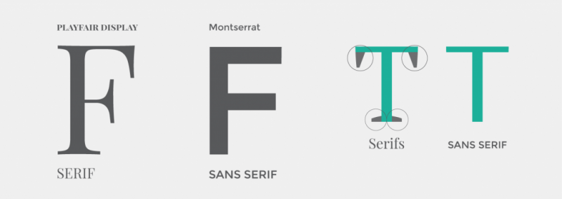
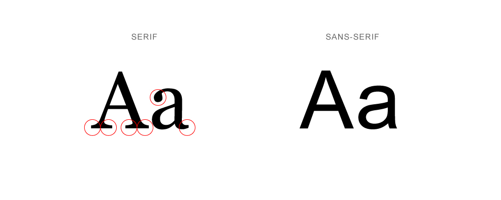
The two main type classifications you see are called serif and sans serif. Other classifications include slab serif, blackletter, script, modern, and decorative. Let's start with the most common two, and then touch on just a few others to give you an idea of what they're all about.
Serif
Remember when I pointed out the little foot in the word “Faulty?” Typefaces with feet like that are called serif. You can see where I highlighted these little feet below:
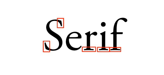
Common serif typefaces include Times New Roman, Georgia, and Garamond. If you’re reading a novel, you might notice the body text is a serif. That’s because a serif is much easier to read in long, printed works due to the distinctiveness between letters.
Sans Serif
In French, the word “sans” means “without.” So the term “sans serif” literally means “without serif.” In the image below, you’ll notice the words lack serifs, as I pointed out with the red arrows.
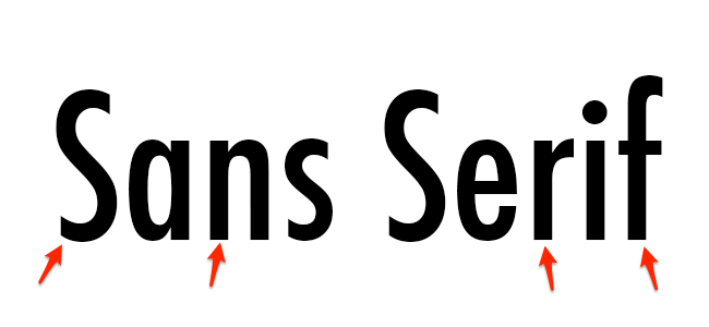
Common sans serif typefaces include Arial, Verdana, and Futura. You’ll see a lot of sans serifs being used in blog posts and documents on the web because it feels more modern and looks great even at lower screen resolutions.
Blackletter
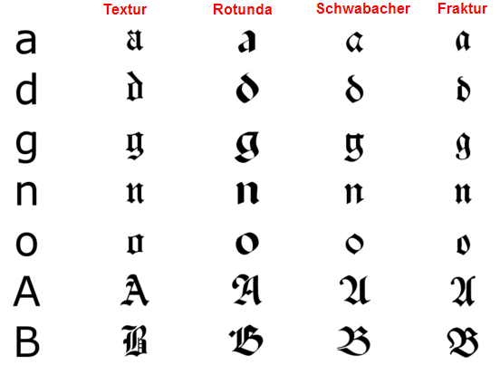
Blackletter typefaces, also referred to as Gothic, Fraktur or Old English, are known for its dramatic thick and thin strokes and its elaborate swirls on the serifs. These typefaces are based on early manuscript writing -- in fact, blackletters were used in Gutenberg's Bible, one of the first books ever printed in Europe. They were much more popular before 1500 than they are today.
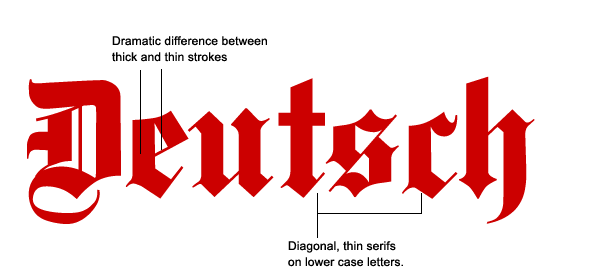
As you can tell, blackletters are pretty hard to read, which is why they're not typically used for body type. You'll usually see them in headers, logos, posters, and signs -- like on newspaper nameplates (New York Times' logo, anyone?), or on the headers of certificates, diplomas, or degrees. Common blackletter fonts include Cloister Black, Deutsche Zierschrift, and Germanica.
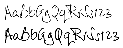
Script
Script typefaces are based upon the varied and often fluid strokes created by handwriting. As scalable computer typefaces, characters in these scripts can now string together with one another automatically so they convincingly mimic handwriting, rather than users having to manually pick and choose which letters go after which -- which you can imagine was a painstaking process.
Under the umbrella of a script typeface, there are two basic classifications: formal and casual. Formal scripts are often reminiscent of the handwritten letterforms common in the seventeenth and eighteenth centuries, and they’re used for elegant designs like invitations and diplomas, not for body copy.
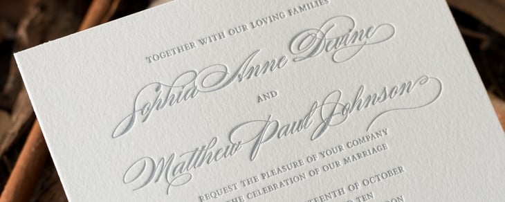
Casual scripts, or informal scripts, are just that: less formal script typefaces that look more like everyday handwriting
Those are just a few examples of type classifications to give you an idea of how they work. But, since this is a blog post, not a typography course, let's move on to type families.
Type Classification
Serif is any of the short lines stemming from and at an angle to the upper and lower ends of the strokes of a letter
Sans means "without"
So a Sans-Serif font is without Serif.
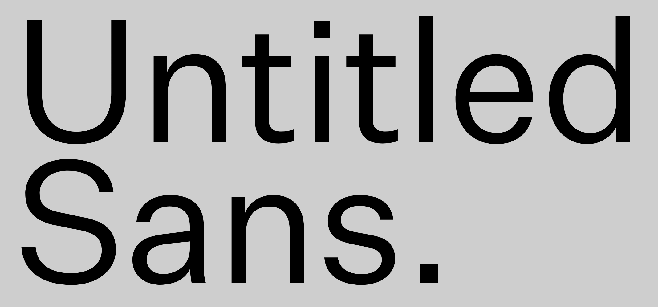
Untitled Sans, is a "Sans" font, it's not a serif font.